


Conor Moore, head of design, PML Group with this week’s Out \ Look on Out of Home
Out of Home doesn’t just ask for attention politely. It earns it. There’s no buffer, no scroll, and no second chance. It sits in the real world as people move through it, and in that fleeting moment it either connects or it’s ignored. That’s what makes designing for the medium so rewarding. It’s immediate. It’s honest. And when it works, you feel it.
Our latest iQ research, conducted with Ipsos B&A, backs this up. Campaigns that are contextually relevant, visually clear and creatively focused consistently outperform. They don’t just get seen, they hold attention and leave something behind.
This latest wave of research focused on real-world campaigns live across Dublin in the first half of 2025. It tested how well each execution grabbed attention, resonated emotionally and influenced brand perception. The response was consistent. 68 percent of respondents said ads tied to a specific time, place or occasion were more attention-grabbing. Two thirds said they were more memorable. Six in ten said they felt more positively about the brand. That reinforces a simple creative truth that relevance drives resonance.
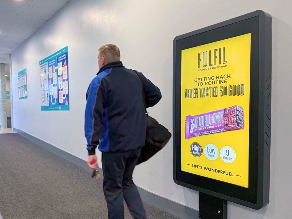
FULFIL understood the January mindset and met it with energy and clarity. The creative focused on the return to routine, using bold colour and a clear, upbeat line. It appeared in just the right places: in gyms, train stations and indoor high-traffic zones, and felt like it belonged in each of them. This kind of design doesn’t distract. It clicks. With 67 percent of people citing simple, easy-to-read creative as a key factor in grabbing attention, it’s a reminder that clarity still cuts through.
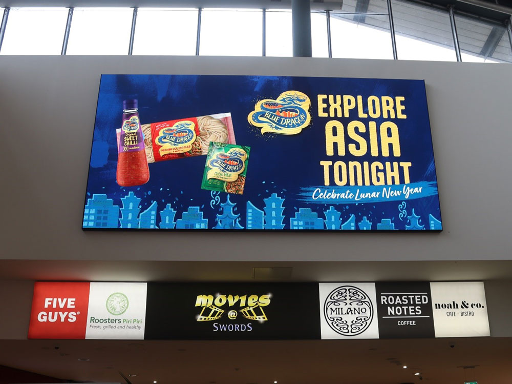
Blue Dragon’s “Explore Asia Tonight” paired strong colour with seasonal timing. Tied to Lunar New Year, the creative evoked flavour, occasion and culture without having to explain itself. It felt considered. A third of respondents said message relevance to a time, place or event helped make an ad more attention-worthy. Blue Dragon showed how thoughtful creative paired with smart timing can add dimension to a brand.
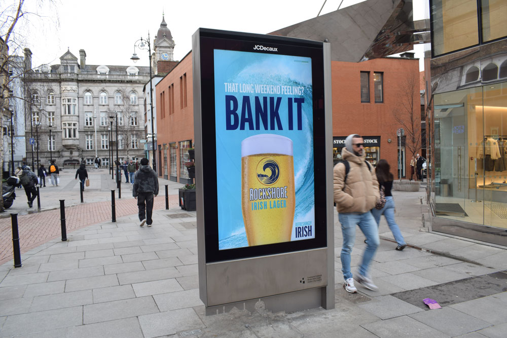
Rockshore leaned into tone and timing with “Bank It.” A clever line, placed perfectly, that nodded to the Bank Holiday weekend while encouraging shared moments. It was punchy and self-contained, letting the copy do the heavy lifting. According to the findings, over half of respondents said humour or clever writing helped catch their attention. This was proof that when the writing is strong, it can carry the creative.
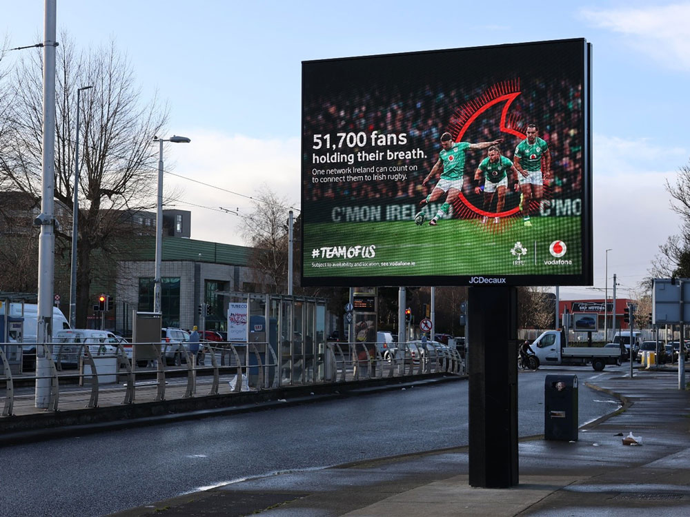
Vodafone’s Six Nations campaign took a more emotional approach. “51,700 fans holding their breath”, one line, backed by a powerful image and subtle branding. It dramatised national anticipation and made that feeling public. When creative connects with how people feel in a shared moment, it does more than inform. It builds affinity. It also landed at just the right time to reinforce Vodafone’s sponsorship, which felt earned rather than imposed.
While special formats like projections and 3D builds still offer standout impact, our findings reaffirm that the most consistently effective creative elements remain the simplest. 69 percent of respondents pointed to strong visuals. 67 percent to clean, simple layouts. These insights echo our Creative Elements research, where elements like product clarity, contrast and copy length drove sharp increases in recall and consideration. The strongest creative wasn’t necessarily the most elaborate, it was the best aligned.
And when that alignment includes emotional relevance, the effect is even more powerful. The Moments of Truth study showed that matching creative to the right time or mood increased brain response by over 18 percent. Those campaigns didn’t just land, they lingered. They were better remembered and more engaging.
All of this brings us back to something simple. Good design doesn’t shout. It communicates. In OOH, that means being clear, timely and visually grounded. We’re not just designing creative. We’re designing for context. And when context is considered, everything else becomes easier: the layout, the tone, the message, even the media choice. Because the ad already feels like it belongs.
In the end, that’s what earns attention. Not tricks or noise or extra layers. Just the right idea, in the right place, with the right execution. That’s the craft. And it’s what I love about designing for this medium.


