


 Conor Moore, head of design, PML Group with this week’s Out \ Look on Out of Home – 23rd January 2026
You can tell a lot about a new year by what you see on the OOH in January.
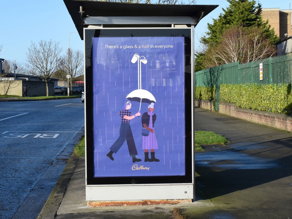
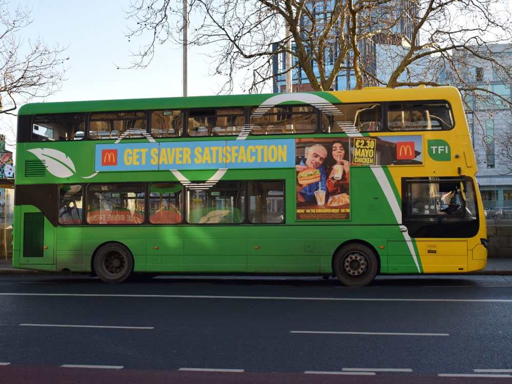
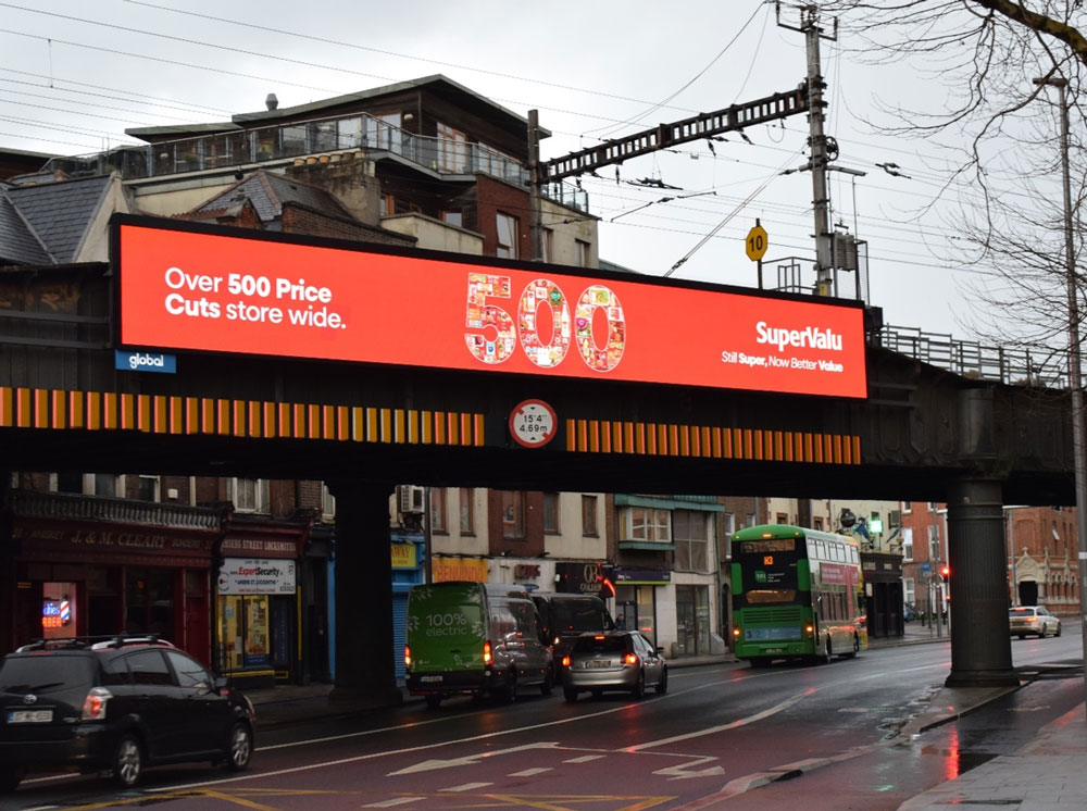
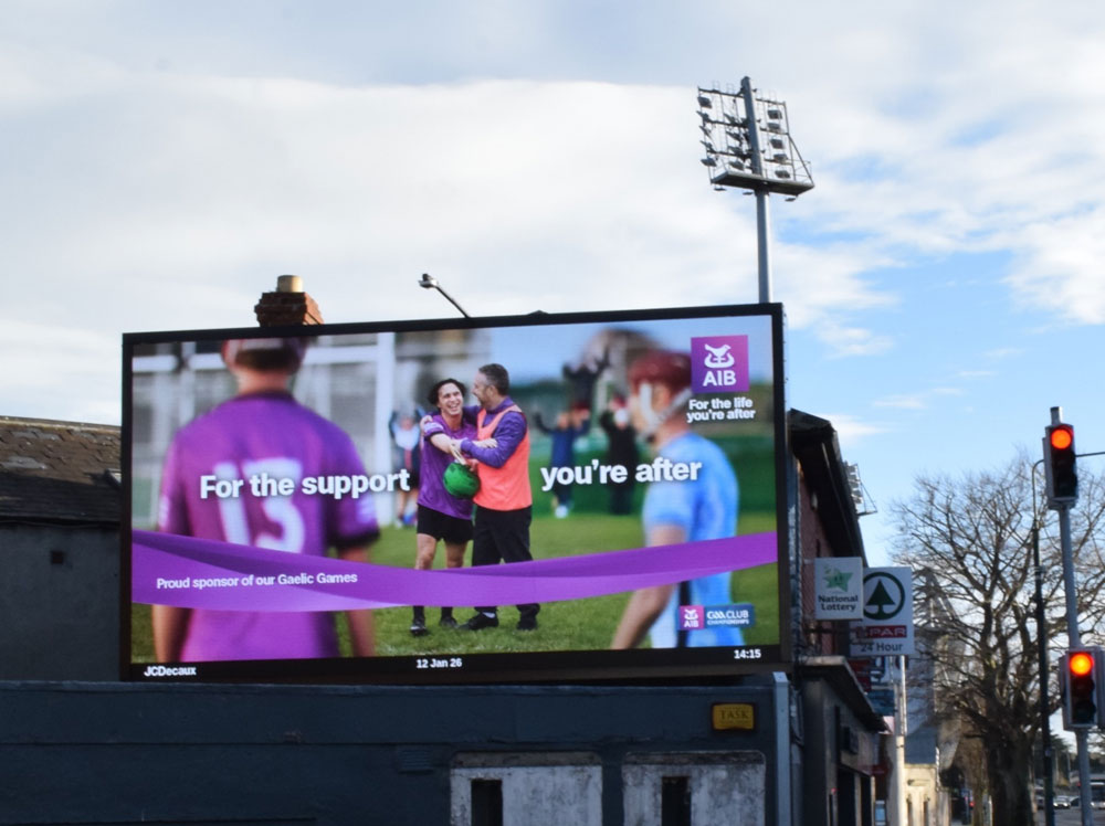
Right now, the wider media and advertising conversation is dominated by AI, addressability and dashboards. But if you step out of the meeting room and actually walk the city, the first things that catch your eye are still simpler than that: a contrasting bus side cutting through grey sky, an emboldening purple sitting in a bus shelter on a wet evening, a familiar yellow that you recognise long before you read a single word.
Before anyone has processed a logo or decoded a line of copy, colour has already done a job.
That is really what makes colour worth revisiting at the start of a year. While strategies, platforms and formats evolve, the way people move through streets, stations and shopping centres hasn’t changed nearly as much. They are still scanning, not studying. They are still giving us seconds, not minutes. And, more often than people expect, their first impression of a campaign is a flash of colour in their peripheral vision.
In that context, colour stops being a purely aesthetic decision. It becomes one of the most important distinctive assets a brand has. When a palette is used consistently across pack, screen, in-store and Out of Home, it turns into a kind of code. People don’t sit down and analyse it; they just feel, “that looks like them”. In our own IMPACT work, we’ve seen plenty of examples where a strong brand colour, combined with simple layout and clear branding, carries more of the recognition job than any individual headline ever could.
That isn’t to say colour can work on its own. But it often works first.
This matters more in 2026 than it ever did, not because Outdoor has lost clarity, but because the real world is a tougher place to earn attentionPeople are moving faster through more visually competitive streets, stations and shopping environments, and campaigns are increasingly designed to live across roadside, transport, retail and digital placements in the same burst. Creative is more frequently versioned for contextual triggers too, which is powerful, but only if a brand’s distinctive assets stay consistent across every variation.
Colour is one of the simplest ways to hold that consistency. As copy, layouts and messages flex by environment or moment, a disciplined palette keeps the work feeling like it belongs to the same brand world. When a contextual line appears on a commuter screen or retail panel, colour is often the first reassurance that this is not just relevant, it is recognisably “ours”.
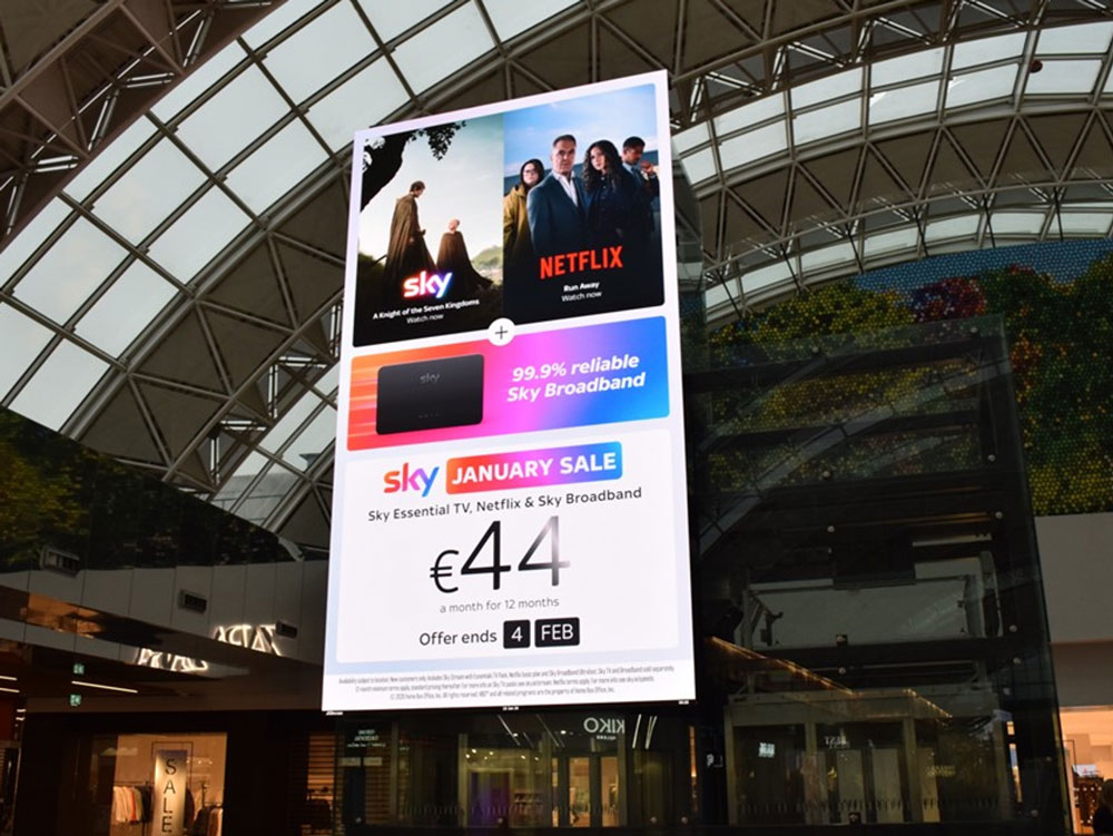
Of course, there’s a gap between how colour behaves in a guidelines document and how it behaves on the street. That is where Out of Home forces more honest decisions. A palette that looks subtle and premium on a white page can struggle badly at 40km/h in the rain. Mid-tone copy on mid-tone backgrounds might feel refined on a laptop; it frequently reads as “blank” on a large roadside billboard or a busy station environment.
Viewing distance, speed and lighting all work against nuance. Most people are encountering OOH creative from several metres away, while moving, under winter cloud or low sun or artificial light. Illumination can wash out pale tones and flatten dark ones. Street furniture, traffic, shop fronts and other ads create constant competition in the same field of view. If we ignore those realities, we end up with work that is technically on-brand but practically invisible.
That is exactly why the best Out of Home creative is not just designed, it is checked in context. It is one thing to approve a layout on a bright screen; it is another to know it will land at speed, in poor light, or against a busy retail backdrop. This is where our Creative Services and PREVIEW process come into their own: assessing legibility, contrast and brand attribution before a campaign goes live, then advising practical adjustments that protect impact on the street, not just in the deck. When clients involve us early, the benefit is simple – fewer compromises on the street, and a higher chance that the work is recognised before it is even read.
This is where a bit of discipline around colour goes a long way. The most effective OOH campaigns tend to be the ones that are unapologetic about contrast. They pick a background that lets the brand and the key line sit clearly on top. They accept that some subtle tonal combinations simply won’t survive the jump from monitor to motorway. They design for the worst conditions – a wet weekday evening, a cluttered junction, a busy mall – rather than the idealised mock-up.
It’s also where the research helps. Between our IMPACT research and newer attention work, we see the same patterns emerging again and again. Simple layouts, strong hierarchy and a confident palette tend to outperform fussy, low-contrast treatments when it comes to recall and correct brand attribution. That doesn’t mean every ad has to look the same, or that there’s no room for creative risk. It does mean that colour is no longer just a matter of taste; it’s part of effectiveness.
None of this is about inventing new rules. It’s more about being honest with ourselves about how people actually experience Outdoor and making sure our colour choices reflect that. When a brand commits to a colour space and uses it with intent, it makes life easier for audiences. They don’t have to work as hard to spot you in a crowded environment. They don’t have to read the small print to realise who is speaking to them. The work feels coherent, even as messages and formats change through the year.
As we start 2026 with a renewed focus on OOH that genuinely has IMPACT, colour is a good place to begin. It is one of the few levers that operates at the speed of a glance and across every format we touch. It can’t carry a weak idea, but it can make a strong one more findable, more recognisable and more memorable.
If the next twelve months are about being seen, understood and remembered in an increasingly complex landscape, then it’s worth spending a little extra time in January asking not just whether our campaigns look good on a slide, but whether our colours are working hard enough on the street. That’s often where the real difference is made, long before anyone notices the clever bit.
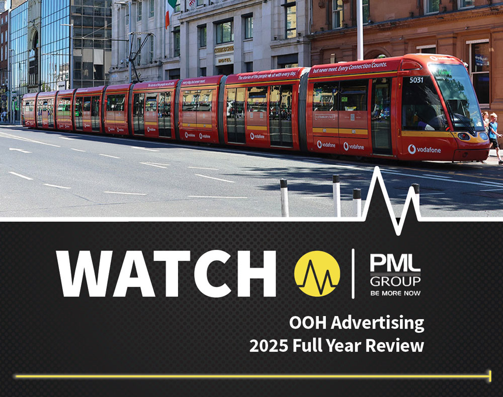
WATCH 2025 Report of OOH Market Released
Last week we published the topline findings for our WATCH report of the OOH market in 2025. The full report is now accessible by clicking the thumbnail below.